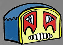
These are the colors I chose. What came out of my dye printer is what is shown below. So, a happy accident since this one looks a bit garish. Make that quite a bit garish. Unfortunately, this dye printer is not printing off any of my palettes correctly, even the ones that don't look like a pizza thrown under a bus. This printer won't even print magenta or black. It's getting difficult.
Sunday, January 6, 2008
What it was supposed to be...
These are the colors I chose. What came out of my dye printer is what is shown below. So, a happy accident since this one looks a bit garish. Make that quite a bit garish. Unfortunately, this dye printer is not printing off any of my palettes correctly, even the ones that don't look like a pizza thrown under a bus. This printer won't even print magenta or black. It's getting difficult.

Sublimation attempt 2
 Again, trouble getting things to line up, but I did much better this time. I think I will fold it in half and make a scarf out of it. The happy mistake about all this is that this isn't at all what it's supposed to look like color wise. I'm beginning to hate my dye printer. I have been working on it all weekend and its only getting worse about printing even a test print. I'm almost getting blank pages! Sigh. Any tips out there? Anyone?
Sublimation attempt
 It's awful hard to line up stripes with a pattern in them. Ultimately this was a failure due to my misalignment of the stripes. Maybe I can use parts of it later.
Friday, November 23, 2007


Wednesday, November 21, 2007


Subscribe to:
Posts (Atom)

 Posts
Posts